
Colorful Watch Dials

Whatever type of watch you have, it comes with a dial that has a color. This is an unavoidable fact of owning a timepiece. And while you may have noticed that certain types of watches come with certain dial colors—for example, dress watches generally come with a white, egg white, or cream color—, in 2022 it seems any color would do. Just like we have thousands of combinations when ordering a cup of coffee at Starbucks, we are now offered with dozens of options for dial colors.
Some dial colors were created for specific reasons while others are just plain fun. In this article, we’ll take a look at classic dial colors and speculate as to why they have persisted throughout the ages, as well as trends in dial colors of the past few years.
 Source: www.monochrome-watches.com
White and Black Dials
Perhaps the most common dial colors, white and black dials, were created for specific reasons. At least, I will assume why and where they come from, but as with many things related to watches, not everything is 100% sure. White dials are certainly descendants of old pocket watches that had enamel dials that always came out white or some shade of it. When pocket watches became wristwatches, brands perhaps just continued this tradition and perhaps had no way of making black dials at first. White dials are regarded as being elegant and versatile and as being easy to read since they contrast with the hands.
 Source: www.lesrhabilleurs.com
Black dials also offer a stark contrast but have a amore sporty look. Although black dials started to become more common starting in the 1950s, they were mostly used for adventure/tool watches. Think Rolex Submariner, Blancpain Fifty Fathoms, and the first Seiko Diver (the 62MAS) that came with an anthracite dial. All of these watches have in common to be divers and I would assume that putting black dial on a diver makes sense as black absorbs light while white reflects it. Having a black dial with white/yellow hands creates a contrast that makes reading time easy.
 Source: www.lepetitpoussoir.fr
Orange Dials
I wanted to talk about orange dial separately from other colors as Doxa was the brand that pioneered this color in the late 1960s. Doxa is a brand that has dedicated itself to making the most legible and sturdiest dive watches. They studied different color options in order to get the most legible dials possible. Through intense research, they realized that orange was a color that faded less the deeper one goes underwater, and combined with black or silver hands, remains extremely legible at great depths.
I find this story quite amazing. The fact that Doxa went to these lengths to make a legible dial says a lot about how much progress we’ve made from the first wristwatches. It also illustrates the necessity for brands to constantly innovate in these areas that we might at first look over. We tend to get distracted by having complex complications and accurate movements, but none of these matter really if we can’t easily read time. Like the Doxa orange, I believe that certain shades of brown also work for divers.
 Source: www.passion-horlogere.com
Other Colors
Then, beyond white, black, and orange dials, everything else that came after like blue, red, yellow are all just for fun. While certain shades of these colors are useful on dive watches—for example anthracite gray, navy blue, and crimson red—most others are just here to decorate and offer options to match our taste in fashion and personalities. Maybe this is just me but I find green watches less legible than black watches, although they are pleasing to look at.
The trend of the past few years has been to offer watches that come with trendy colors. And it seems that brands know what the other one is about to release because they tend to release the same colors. 2021 was the year of “Tiffany Blue” dials and brands in 2022 are more into green. Brands manage to create variations of each color so that not all watches look the same. But there are specific colors that have made horological news and eventually all Swiss and Japanese giants, as well as countless independent brands, join it on these trends.
 Source: www.monochrome-watches.com
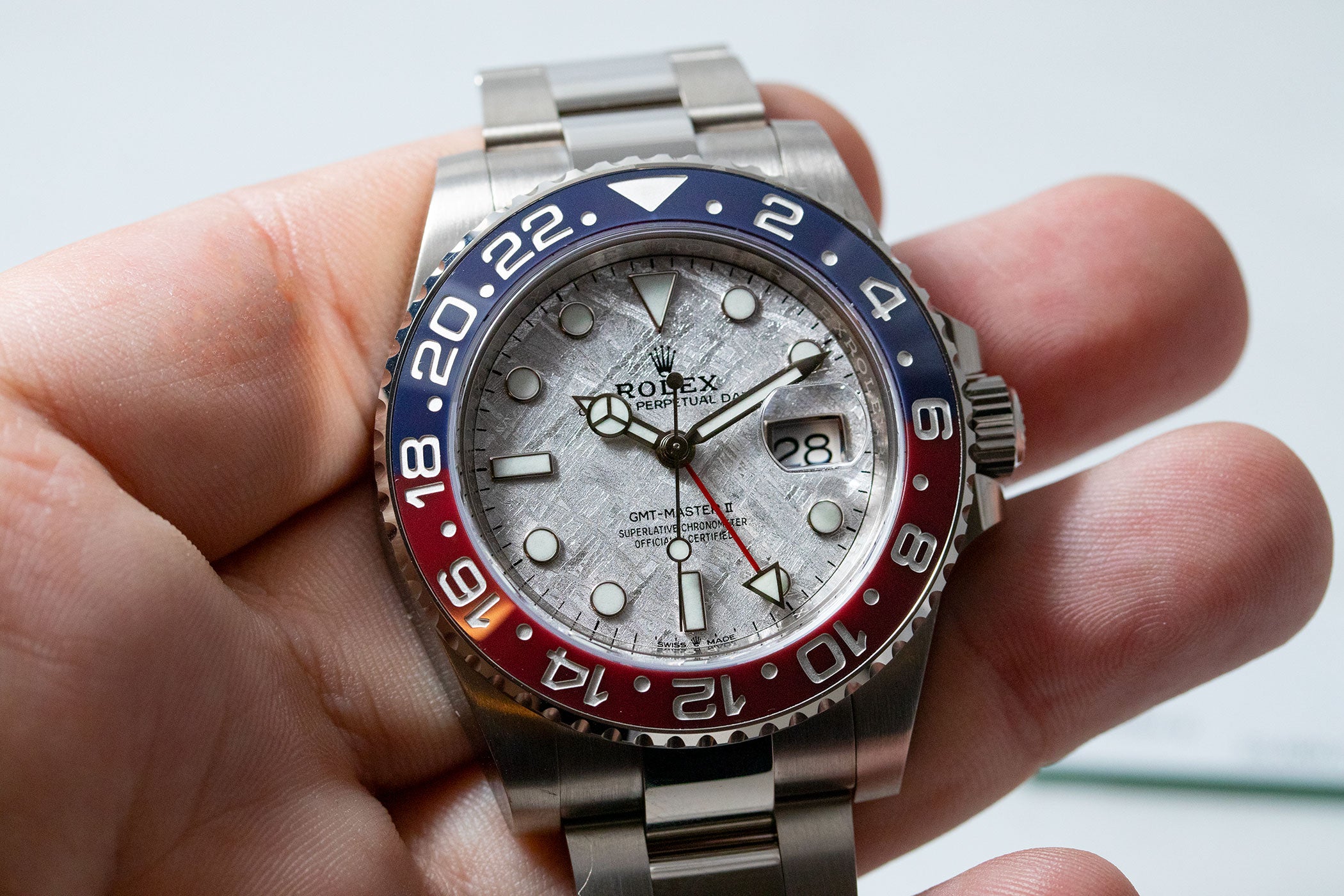
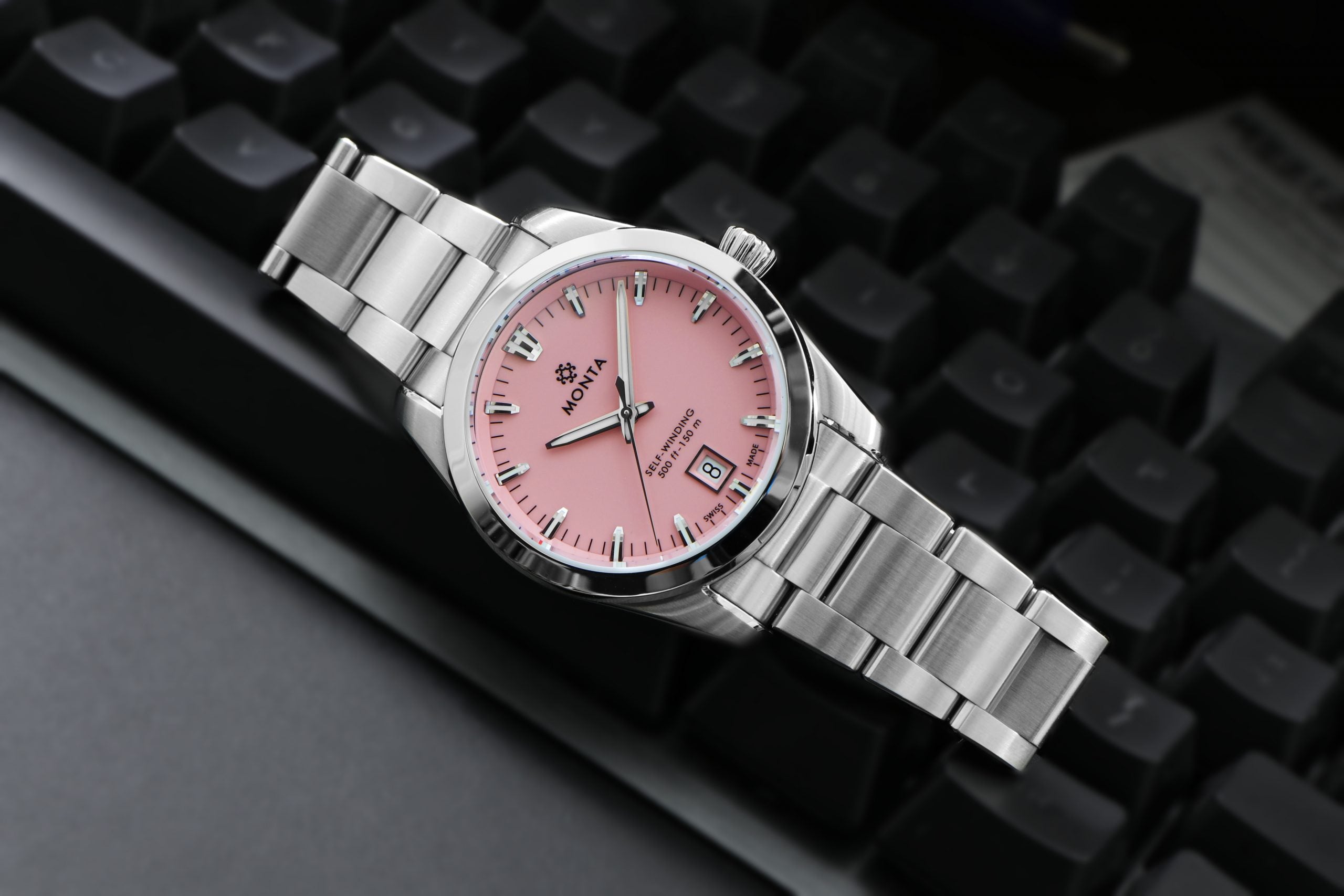
When brands want to be even more unique, they match a dial color with a dial pattern that evoke, for the most part, parts of our natural world. Grand Seiko watches leafy patterns with green colors, Rolex too, and it is not uncommon to see meteorite dials that have outer worldly colors. Of recent releases, I love Grand Seiko’s 62GS-cherry blossom themed watch, and MONTA’s most recent dial colors for their Noble line—candy pink!
 Source: www.beyondthedial.com
Final Thoughts
I started this article by mentioning the fact that watches have to come with a dial that has a color. (Although there are plenty of open-heart dials that are entirely see-through.) But for most watches, they have a color and which color they come with was either born of necessity and ingenuity or out of pure fashion. Another thing to note about dial colors is that they are no longer just “black” or “grey,” but “jet black” or “ink black” and “slate grey” and “concrete grey.” Core dial colors come in different shades and perhaps the more the merrier?
Featured image: www.beyondthedial.com


Leave a comment